QOT
Identity and brand book for a quantum optics research centre
- 5
- laboratory logos, one system
- 19
- brand book pages
- 4
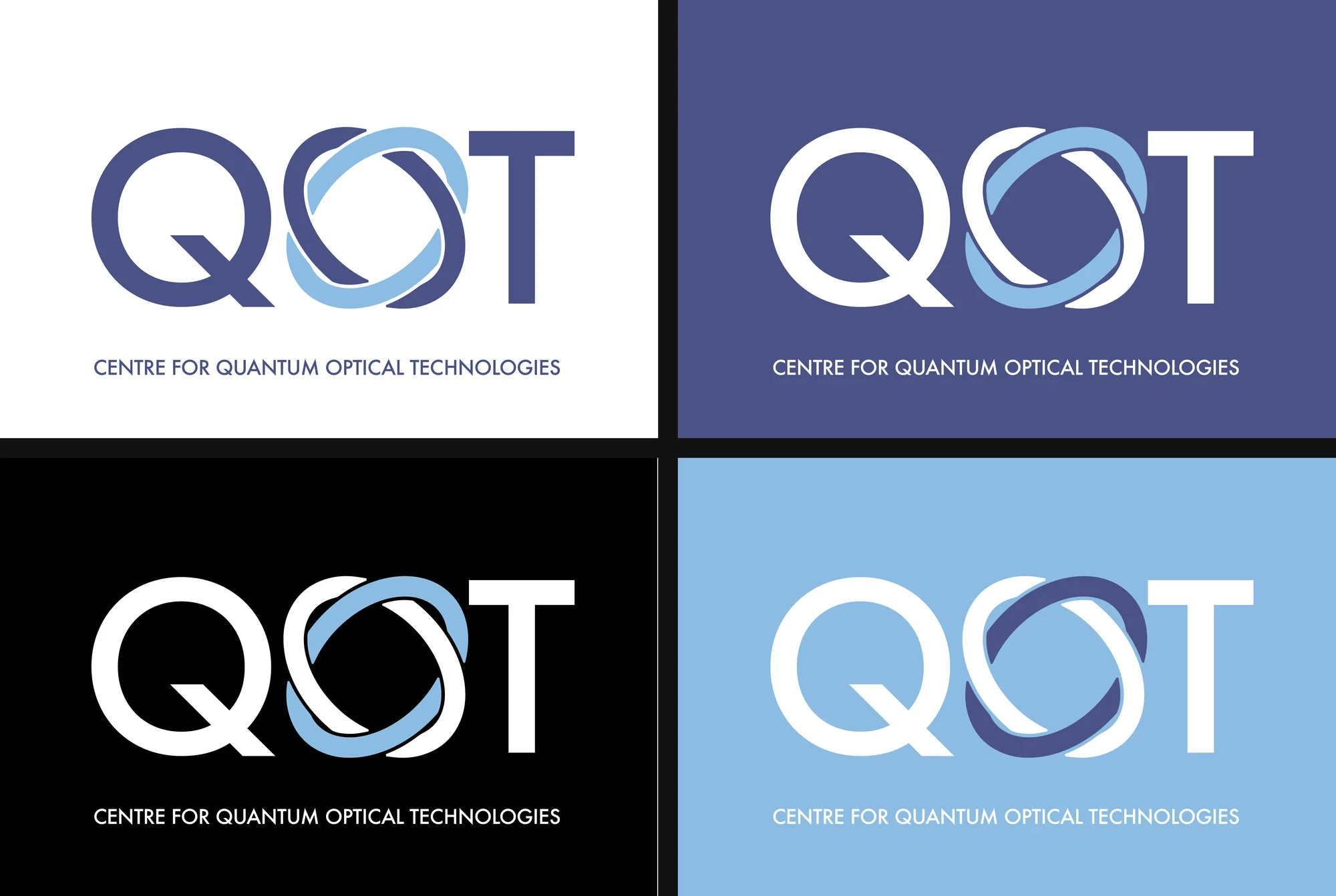
- colour versions of the mark
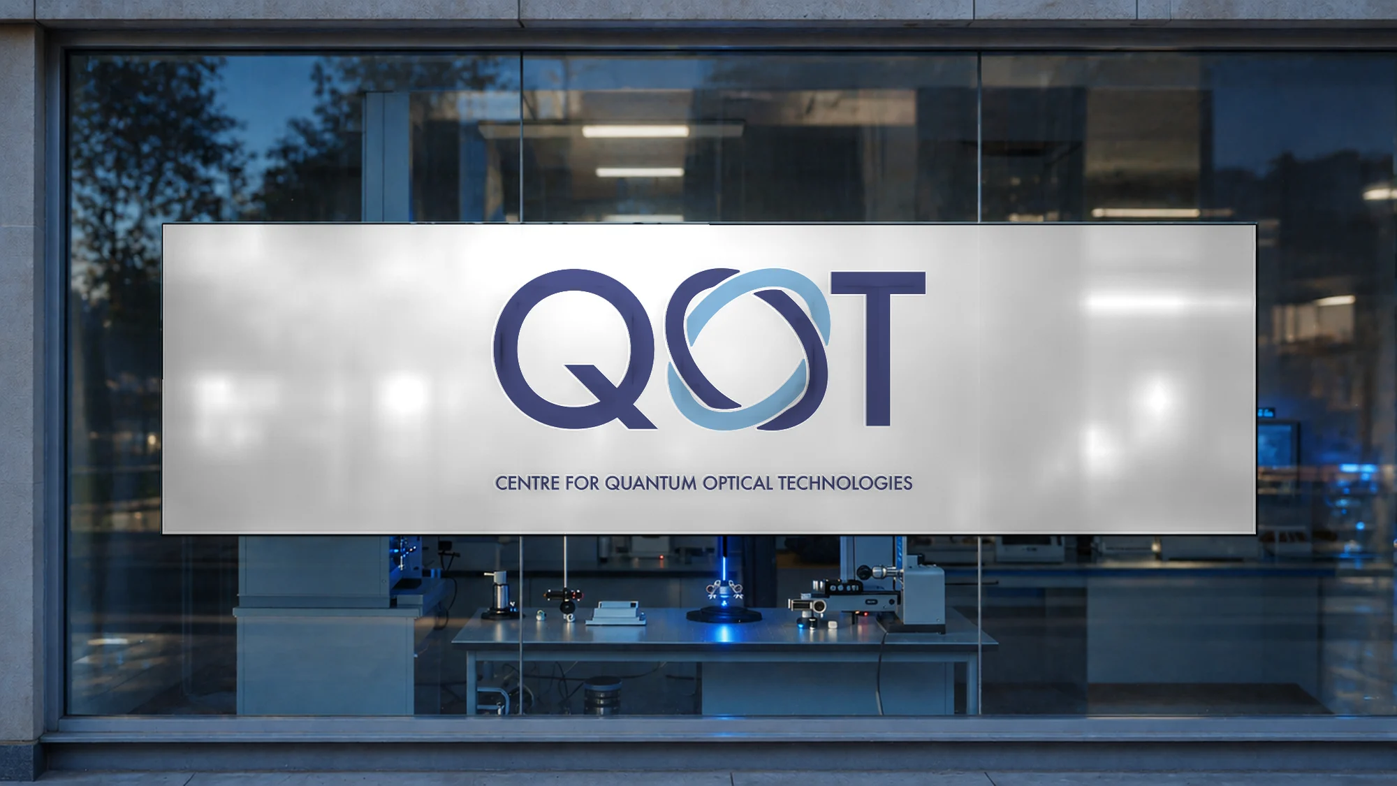
QOT, the Centre for Quantum Optical Technologies, is a research centre working on quantum optics. We designed its mark and brand book, a family of logos for its five laboratories and the templates the centre uses every day.
The idea: two beams, one orbit

The problem
A research centre speaks to scientists, funding bodies and partners at once, and its labs need their own names without splitting the brand. The mark had to say optics without a cliché, sit next to the logos of its funders on equal terms and survive everything from a slide footer to a printed poster.
Decisions
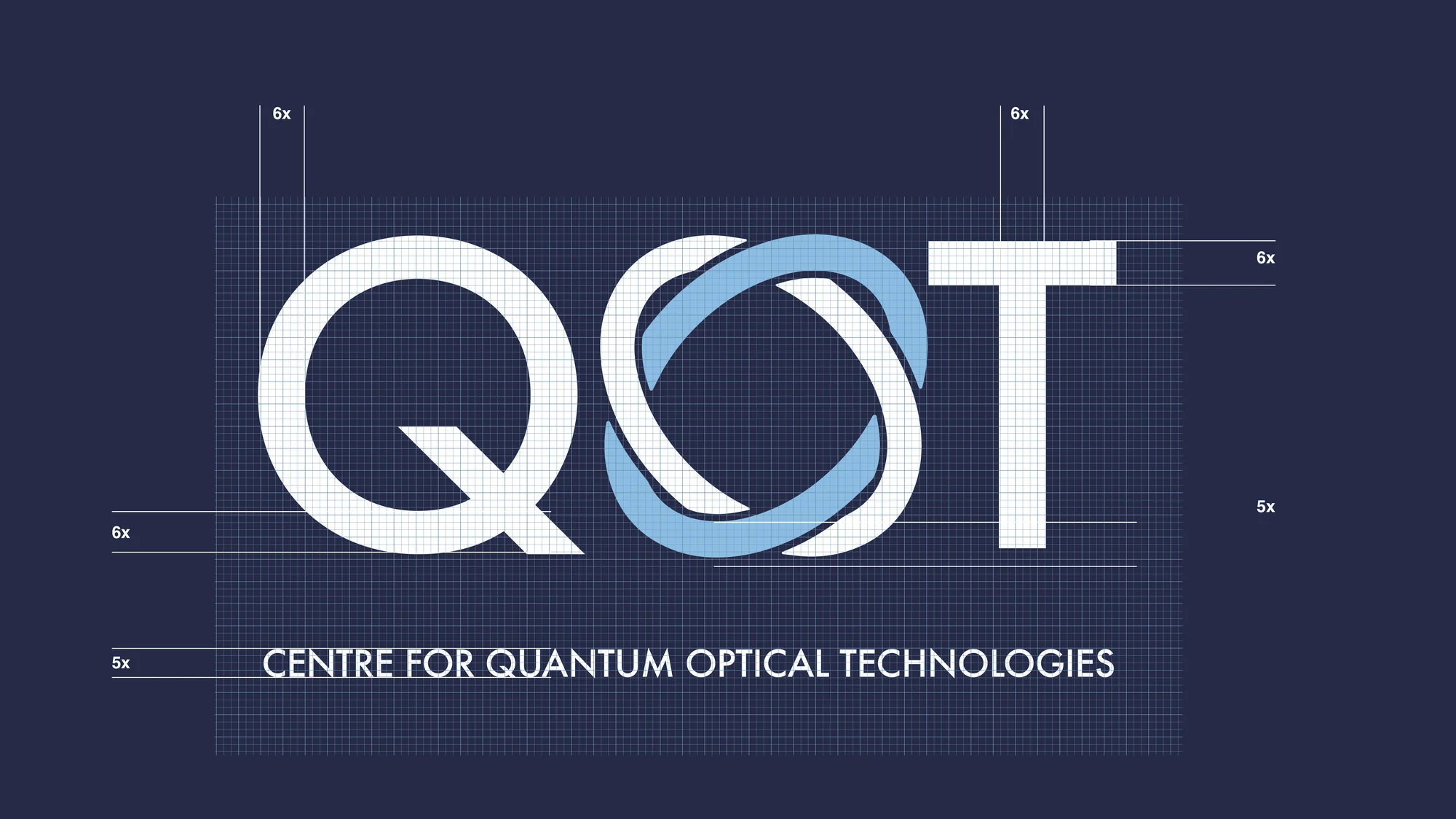
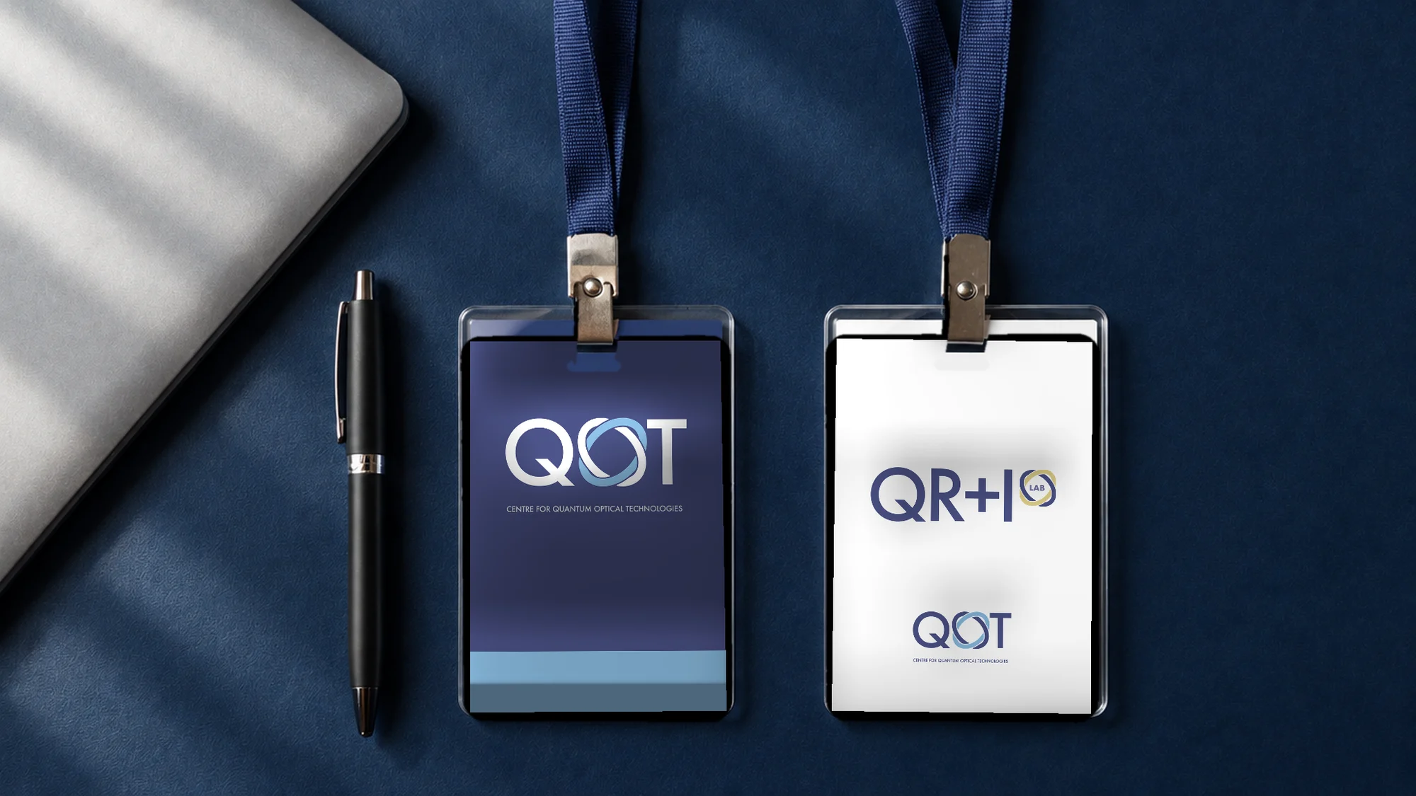
The O of QOT became two paths of light crossing in orbit. The mark is built on a module grid, so its proportions are a rule, not a feeling. The five labs (QT, QM, QI², QR+I, QOD) take the same letterforms and the orbit symbol, so each lab is recognisably QOT and a new one can be added without a new logo project.
How we delivered
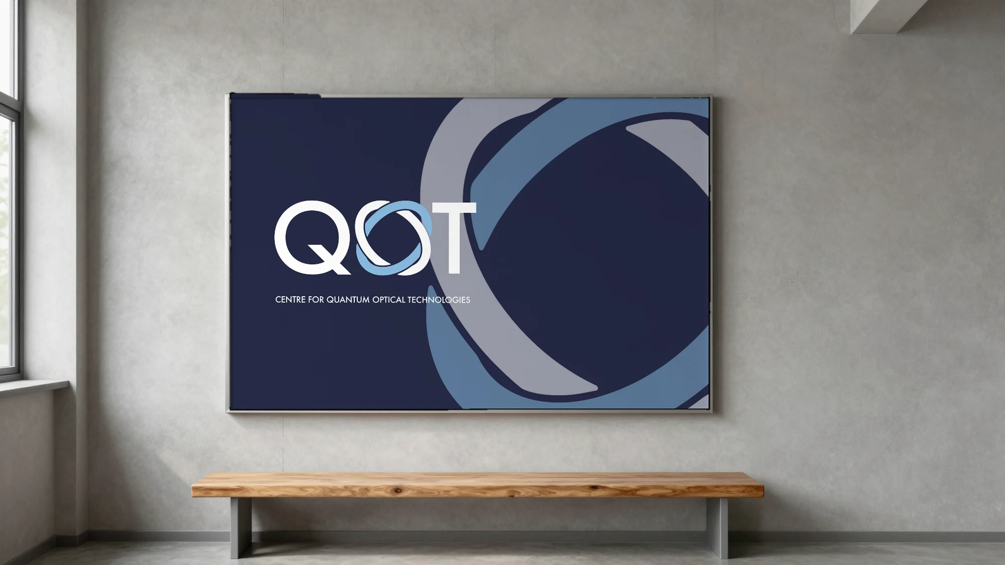
One brand book covers the whole system: construction, clear space, four colour versions, horizontal and vertical lockups, the symbol as a pattern and a watermark, Sen Bold and Regular in a 1:3 ratio, a palette in RGB, CMYK, Pantone and RAL, minimum sizes for screen and print, and the five mistakes that break the mark.
The work
The mark: an O in orbit
The centre, marked
"A research brand is a set of rules the whole team can follow, not a logo in one file.
Outcome
A mark and a 19-page brand book, logos for five laboratories built from one system, layouts for LinkedIn and Twitter, a funding bar with partner logos at one size and a photo direction built on light and optics.
Reflection
Science brands usually fail at the second logo: the first lab that needs its own name. Designing the family first meant the centre could grow without coming back for a new mark.
