BetterWorkplace
Brand umbrella strategy and a DailyFruits rebrand
- 2500+
- Offices served by DailyFruits
- 5
- Brands in the group's portfolio
- 3
- Campaigns with their own landings
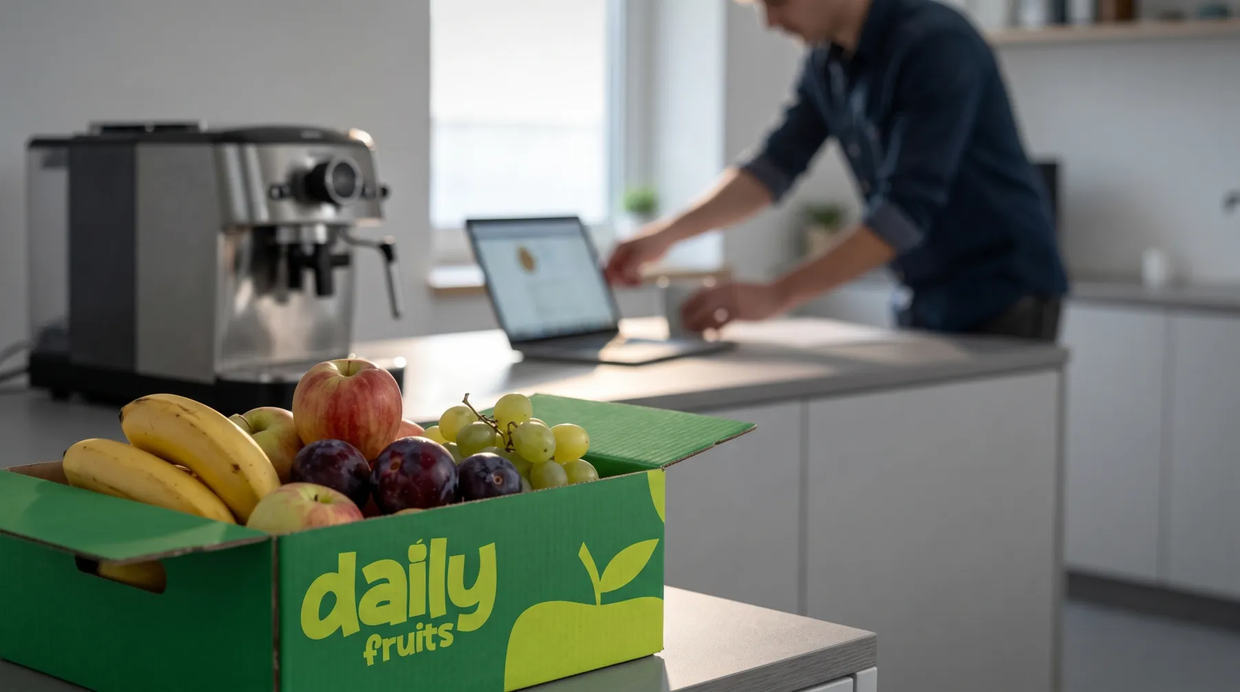
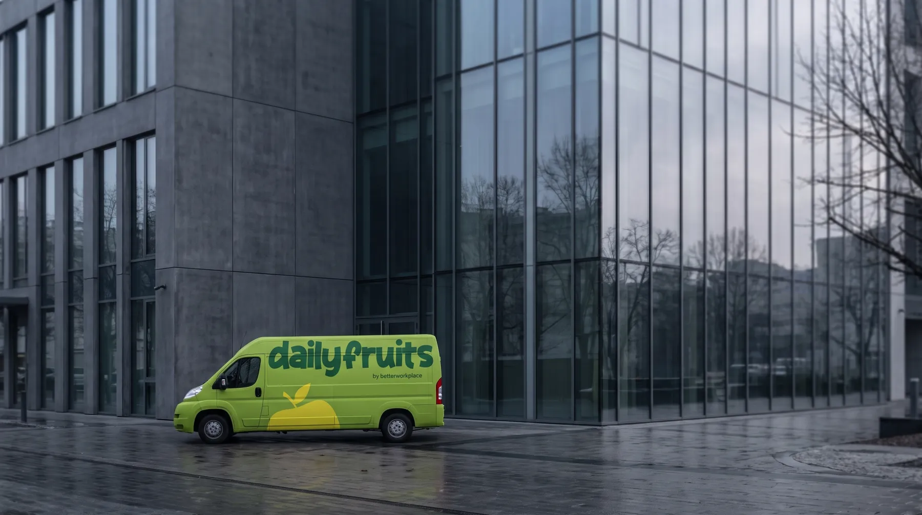
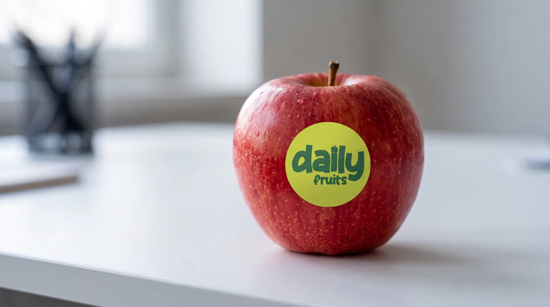
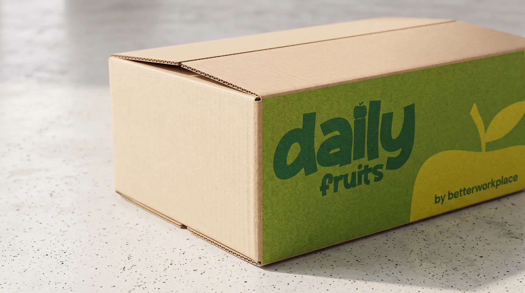
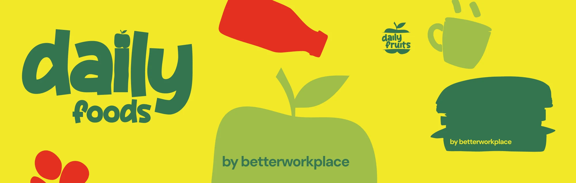
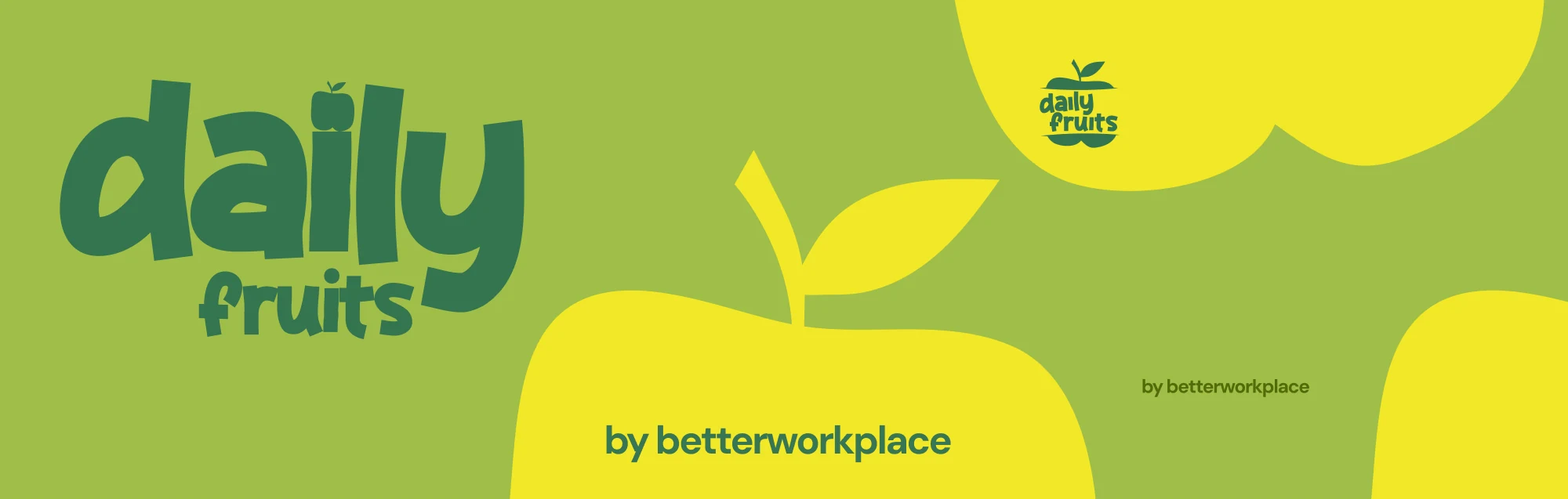
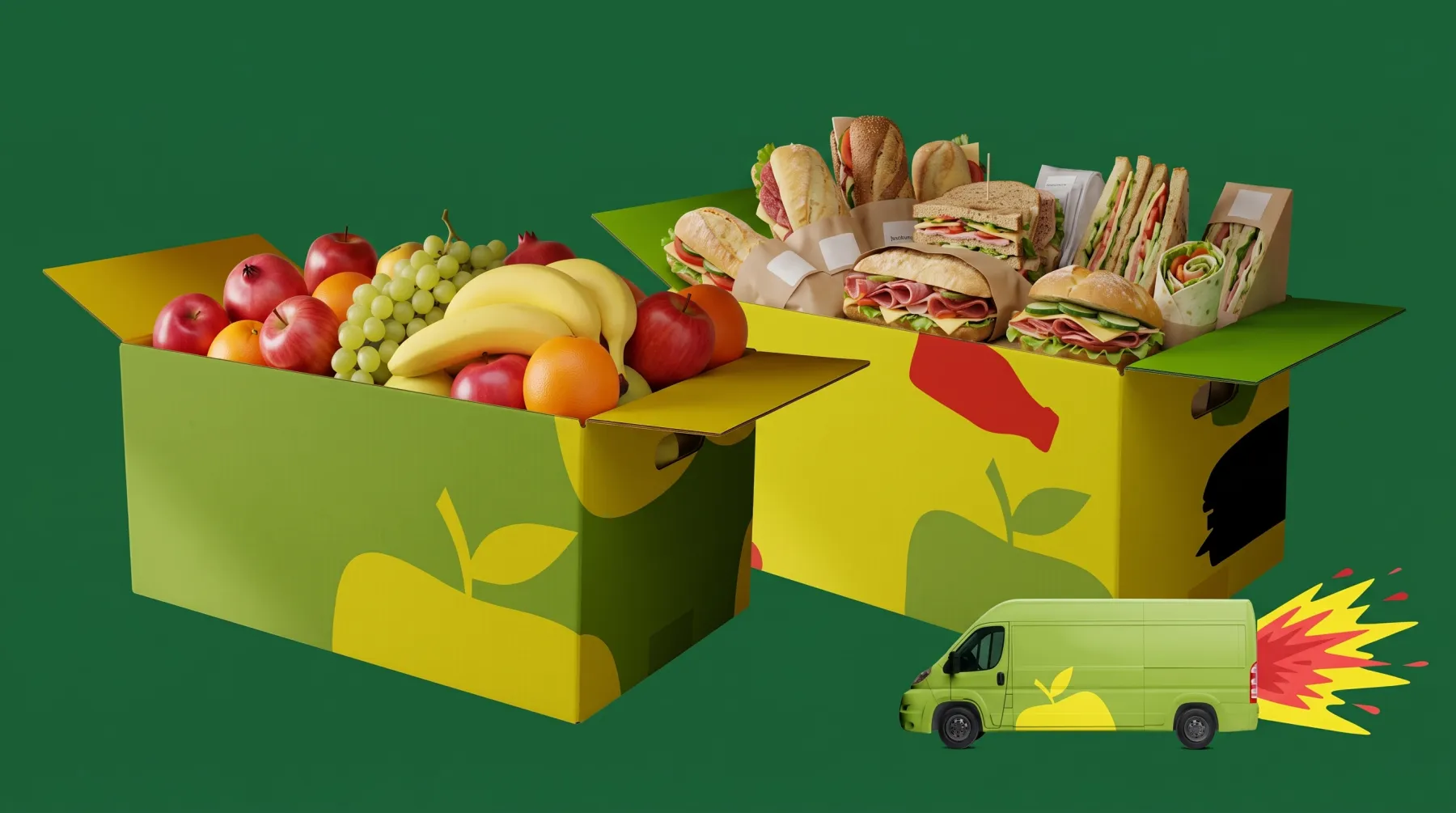
If there is fruit and snacks in your office, there is a good chance they arrive from a brand we rebuilt: DailyFruits delivers to over 2,500 companies across Poland. BetterWorkplace, the group behind it, grew by adding brands: office food, a team benefit budget tool, coffee, wellness services. We worked on the umbrella, that is on what the group actually sells and which entity is a brand rather than a product line, and rebranded DailyFruits, the largest brand in the portfolio, together with its site, offer architecture and campaign system.
The DailyFruits rebrand: the world first, then the mark
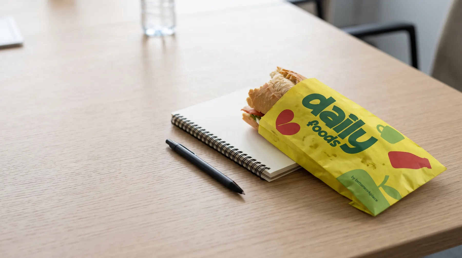
The problem
From the customer's side the group looked like several separate suppliers rather than one offer: each brand had its own site, its own language and its own funnel. DailyFruits was selling sandwiches, breakfast sets, nutrition programmes and events while its communication still said "fruit for the office". Sales talked about problems, the pages talked about product categories, and nobody owned consistency across the brands.
What we took responsibility for
The umbrella question and the biggest brand in it: what the group sells and how its brands relate, then the DailyFruits rebrand with its site, offer architecture, content panel and campaign funnels.
Capabilities at work
- Strategy & Design
- A brand hub for the whole group, an ecosystem audit, a category worth owning, and two architecture models with their costs, with the decision left to the owner. Then the DailyFruits rebrand.
- Digital products
- A site rebuilt from the ground up: category pages that carry real search demand, old addresses carried over without dead links, and a content panel the client's team edits on its own.
- Creative delivery
- Campaigns built as funnels, not posts: a creative that raises the problem, a landing that answers it, remarketing that reminds, a product page that closes.
Decisions
Category before architecture. Poland has two settled benefit categories, sport and health, each owned by a name: Multisport, Medicover. Nutrition has no owner. A group that defines that category stops competing with fruit suppliers and starts talking to a different buyer, with a different budget. Then architecture: we put two models on the table - tighter integration under one brand, or autonomous brands with the group endorsing them - described what each costs and what it buys, and left the decision with the owner. And we rebranded the biggest brand first, because DailyFruits had the traffic and the customers, so the architecture could be proven there before it touched anything else.
How we delivered
Umbrella: an audit of the ecosystem, a map of what the customer sees today, the questions only the owner can answer, two architecture models and a list of tensions to resolve. DailyFruits: a rebrand and a site rebuilt from the ground up, with the offer split into category pages that carry real search demand and deep links folded into one canonical so the pages stop competing with each other, plus a content panel with visual editing and version history so the client's team edits the site without us. Campaigns built as funnels rather than posts: a creative that raises the problem, a landing that answers it, remarketing that reminds, a product page that closes. TeamBudget: personas, funnels, a production scope, a product landing and a 26-second explainer cut on the real interface, where every click lands on a real button and has a consequence.
The work
The identity at full volume















Test without the logo
The new site, live
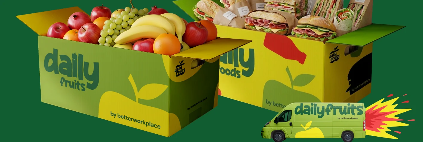
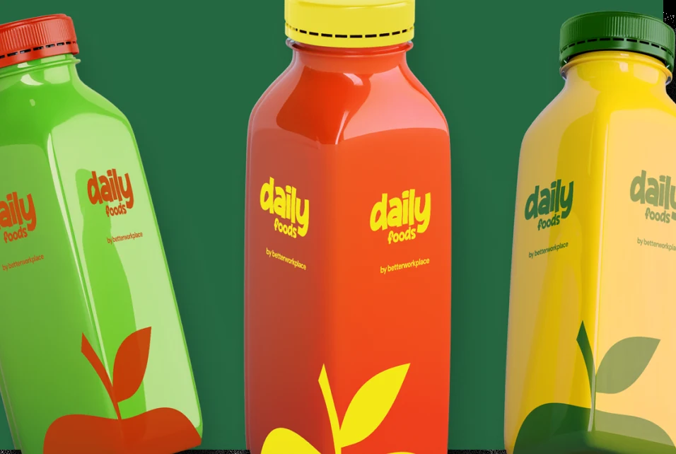
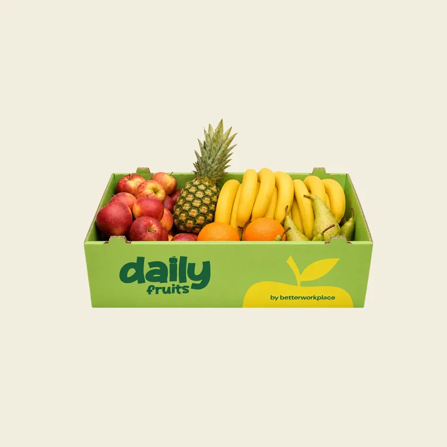
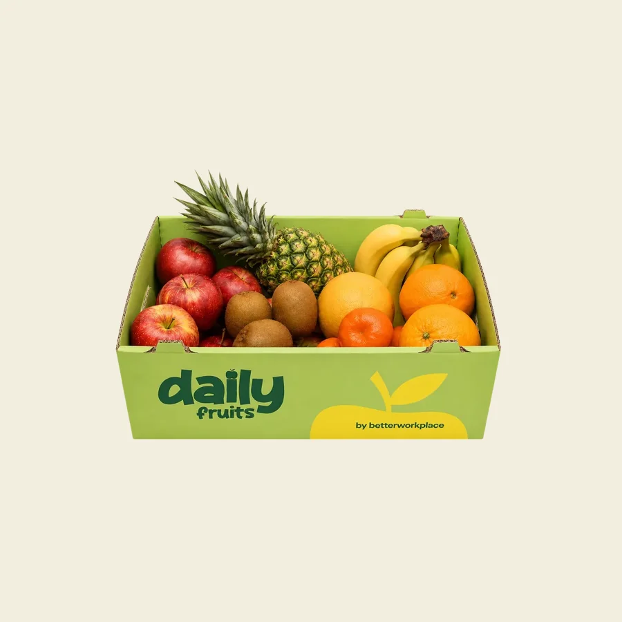
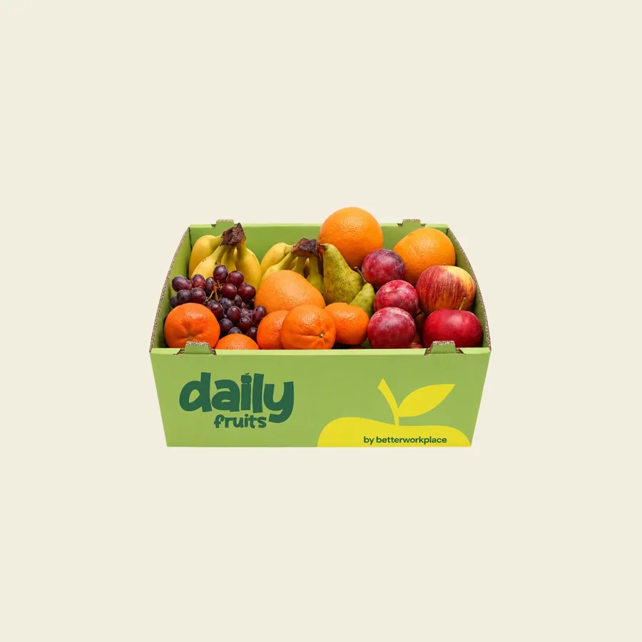
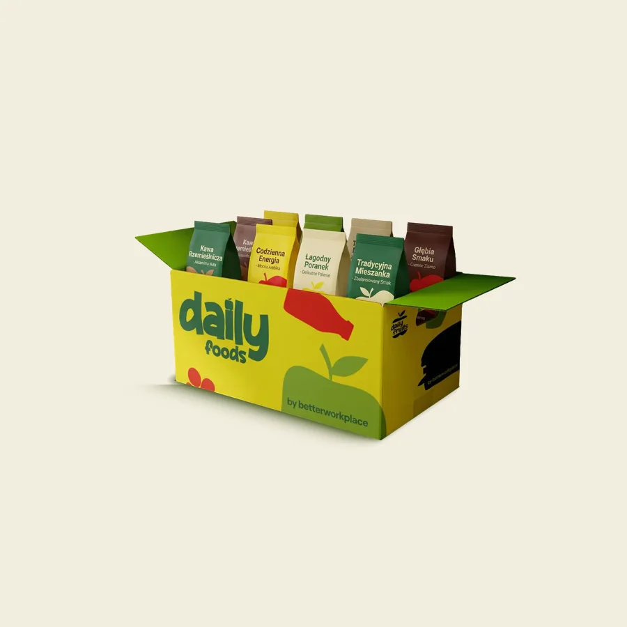
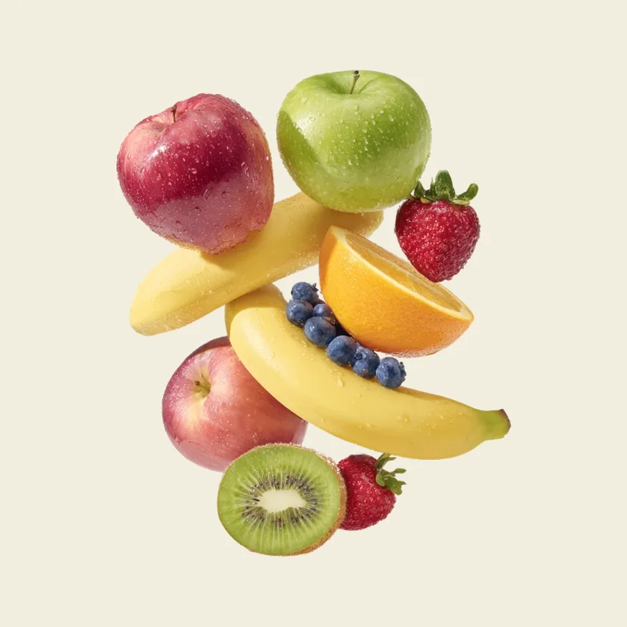
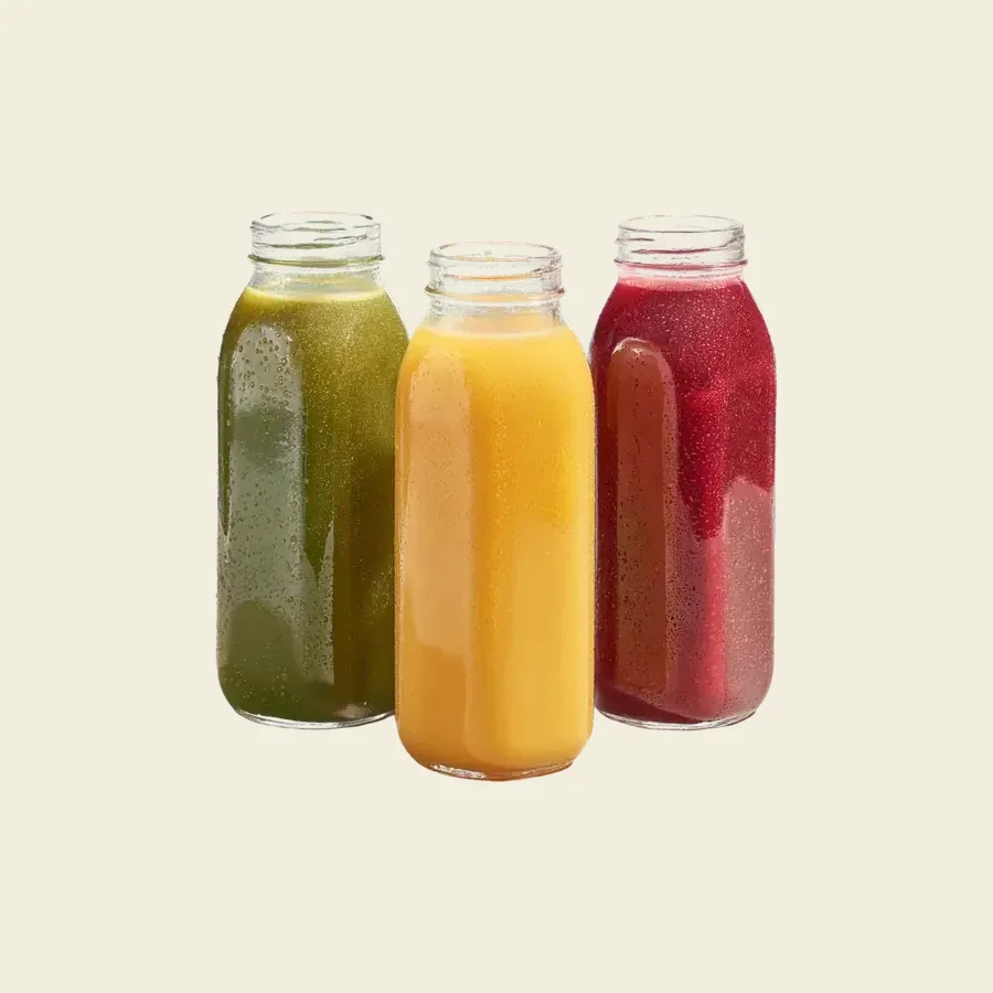
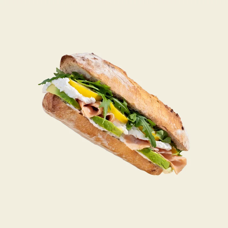
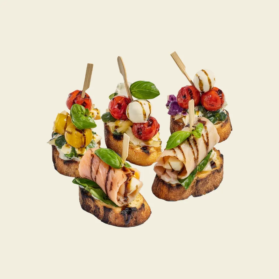
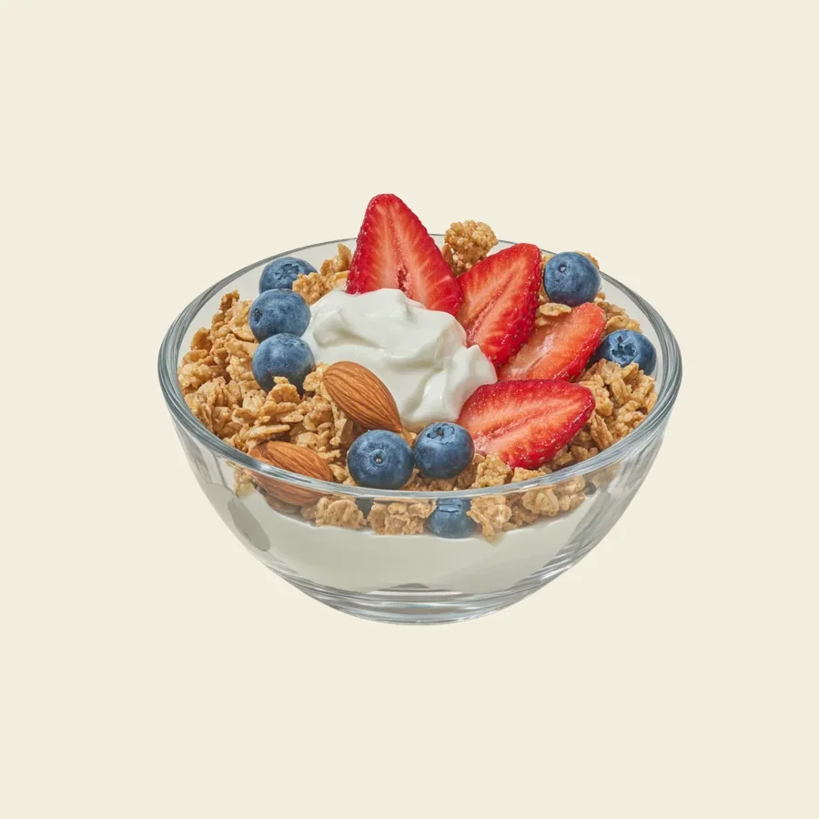
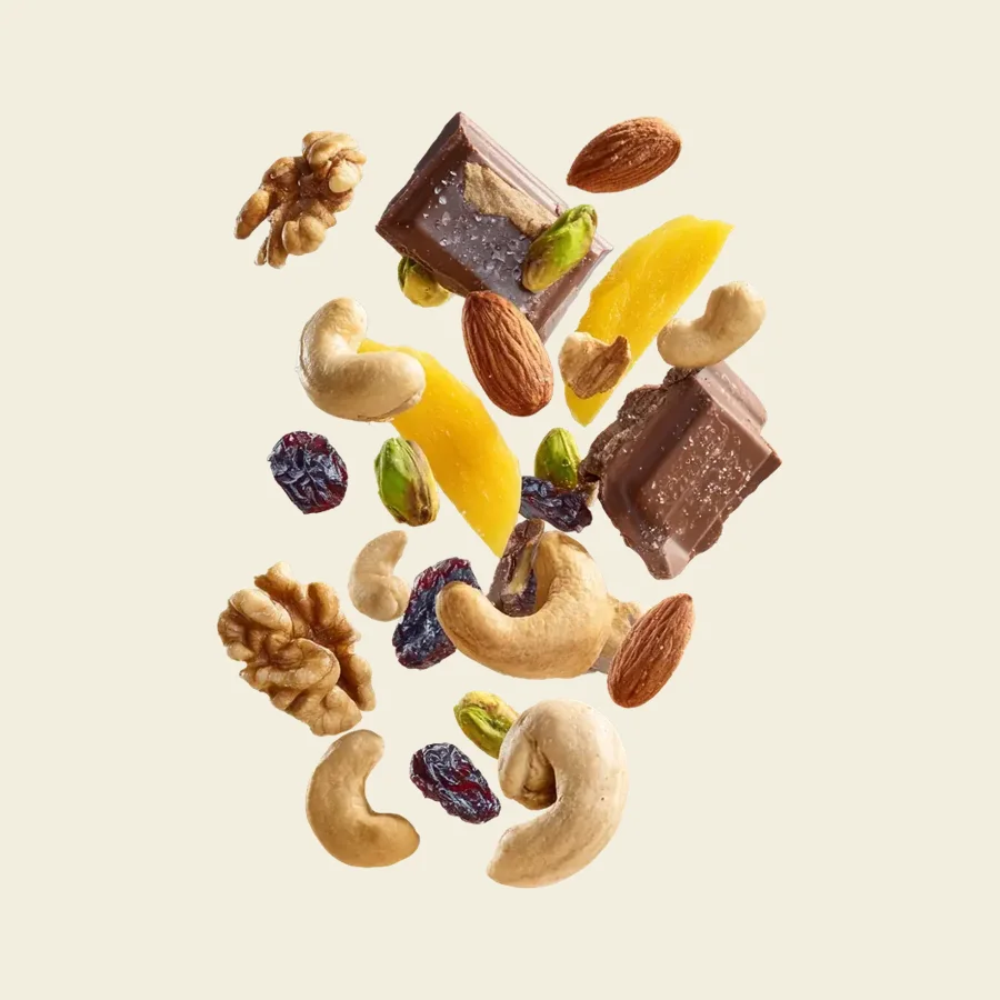
Packaging and the product range
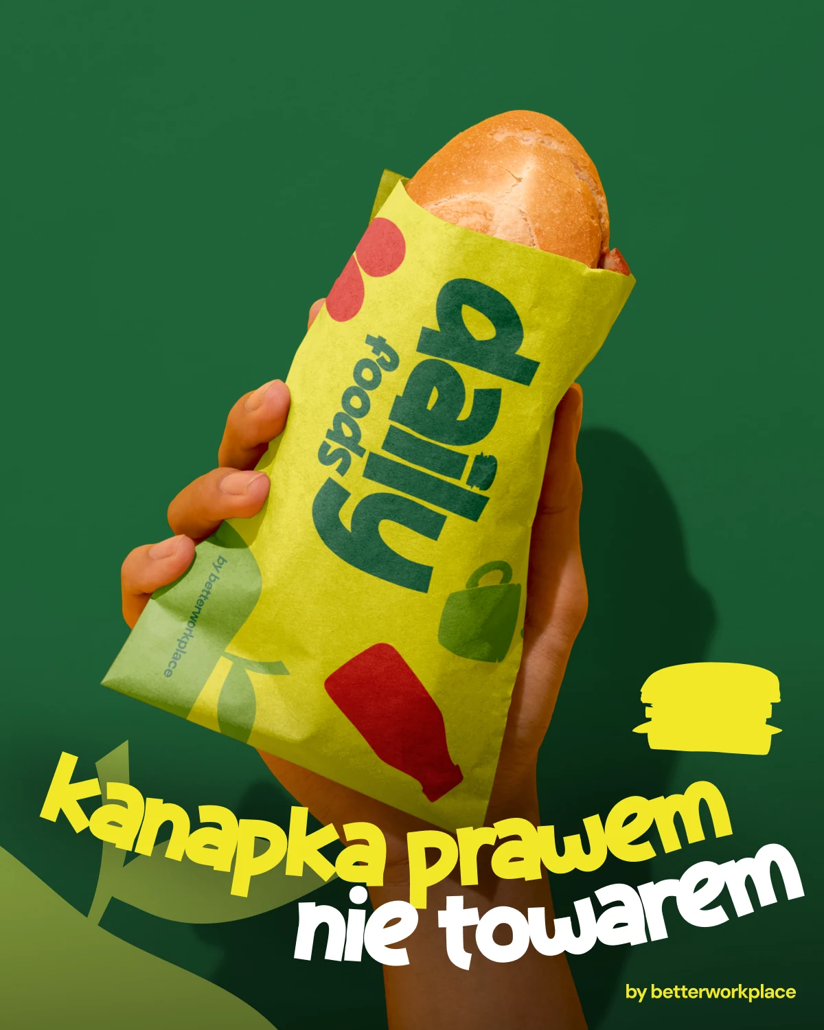
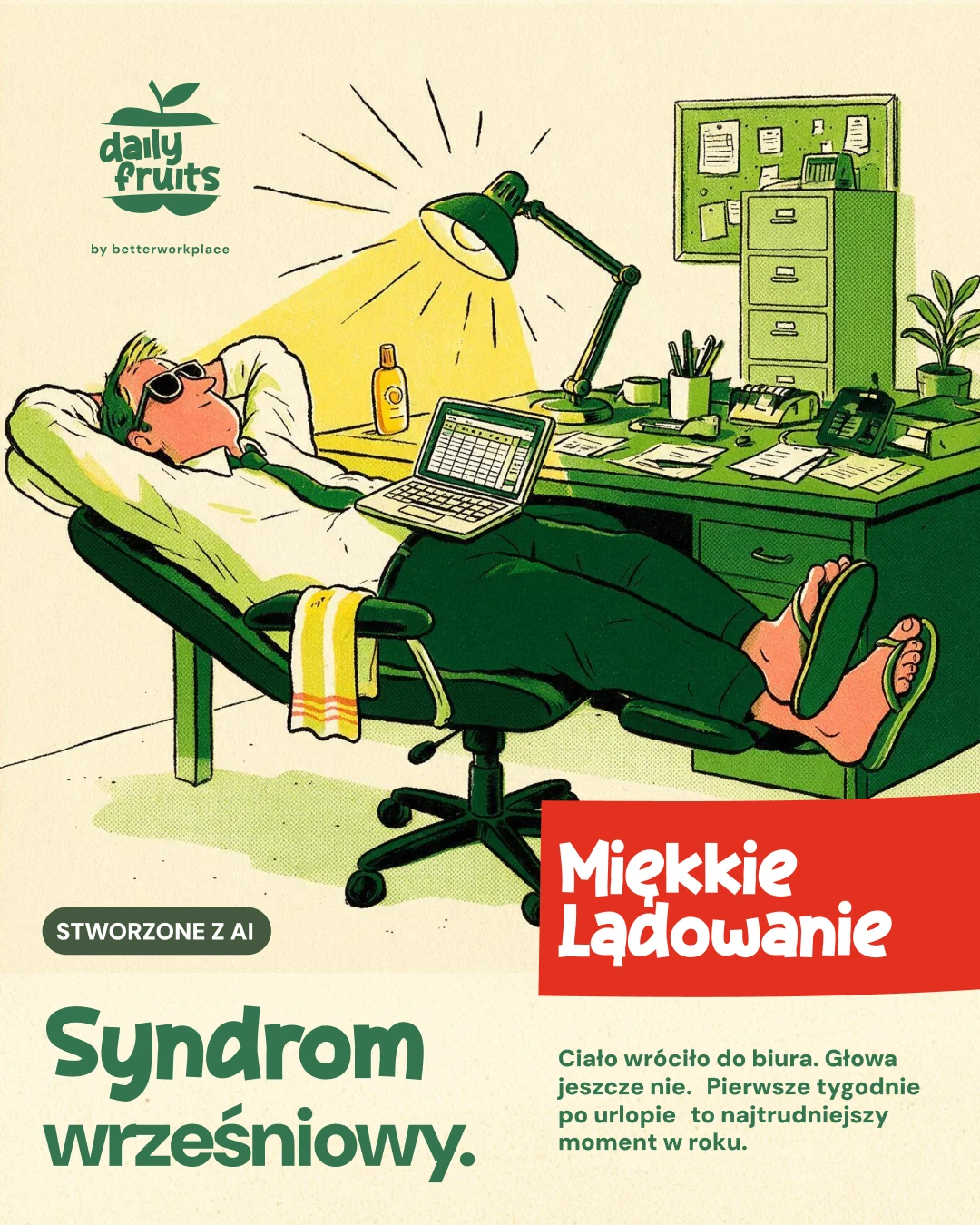
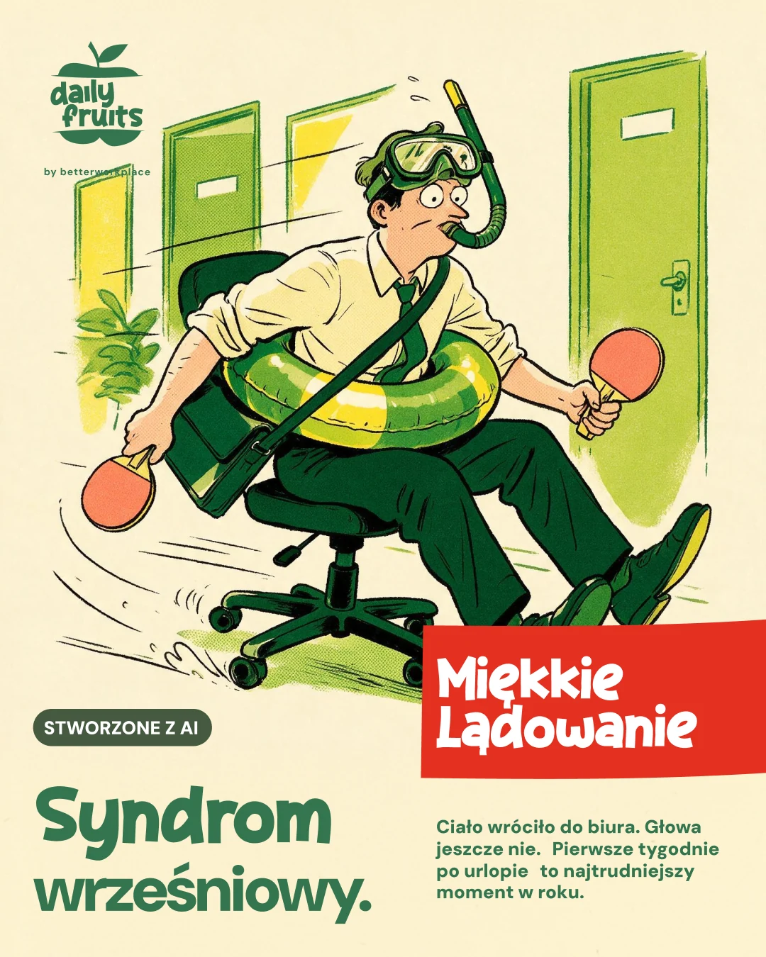
Campaigns with their own landings
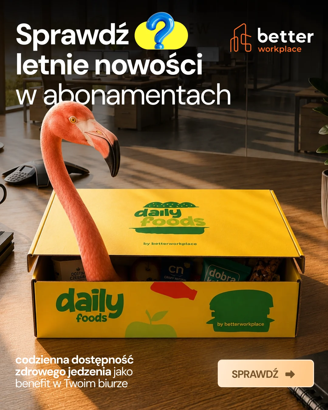
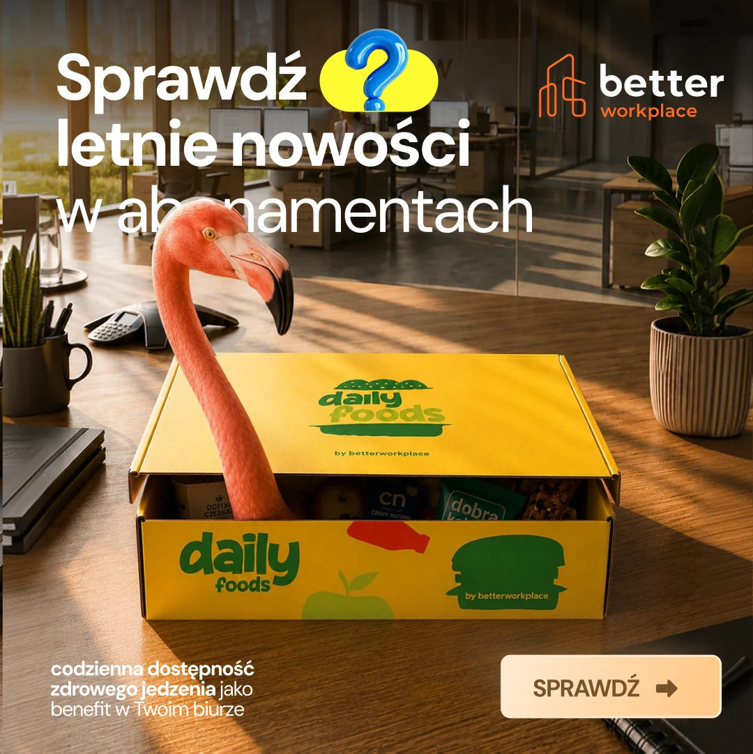
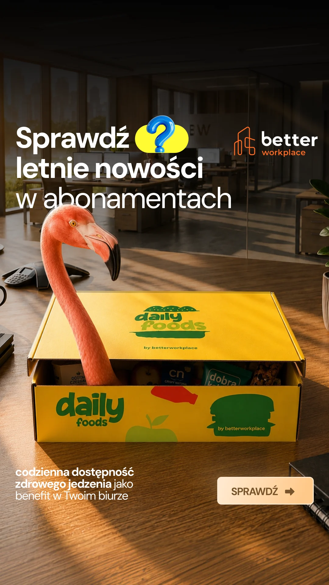
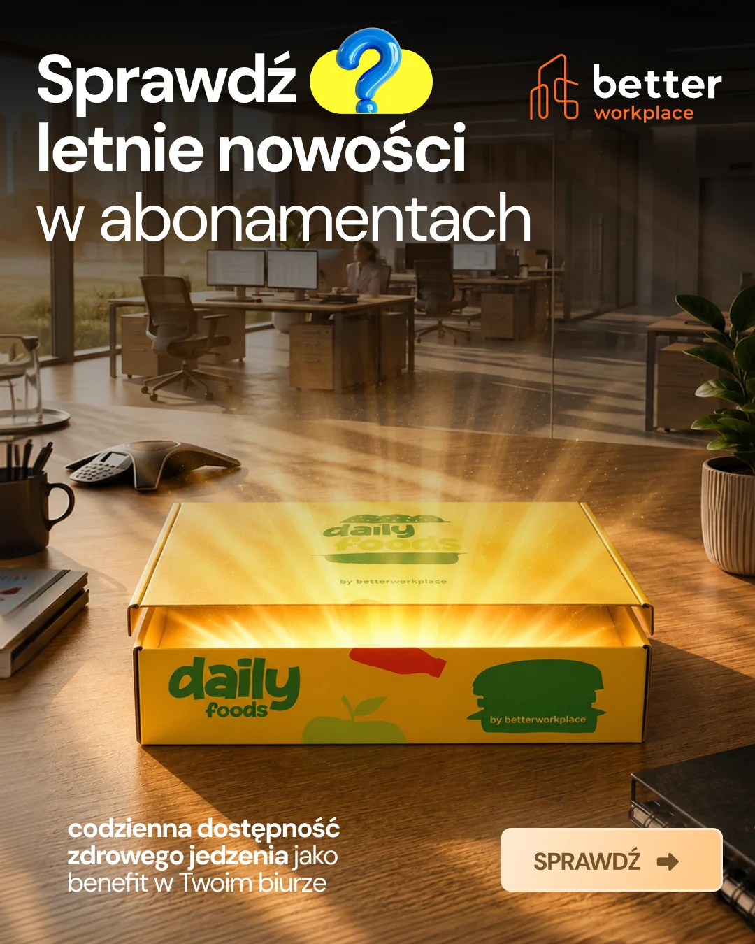
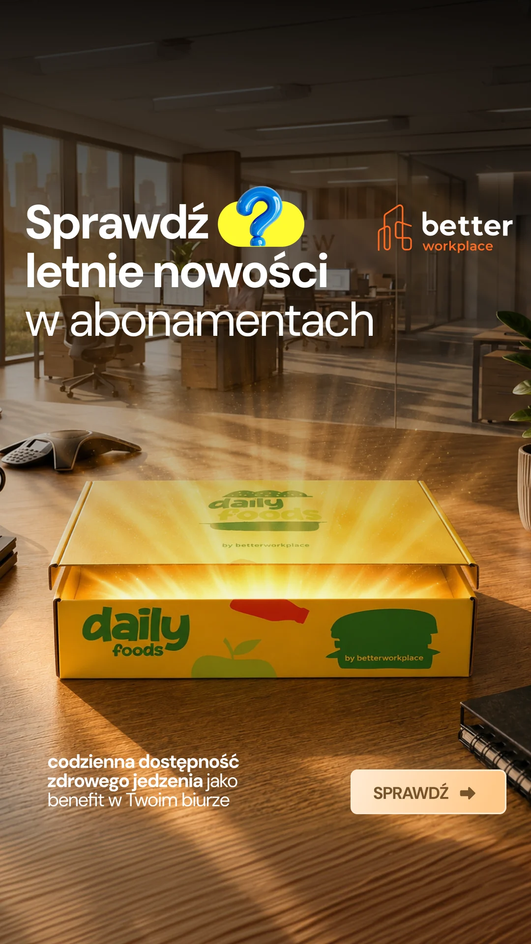
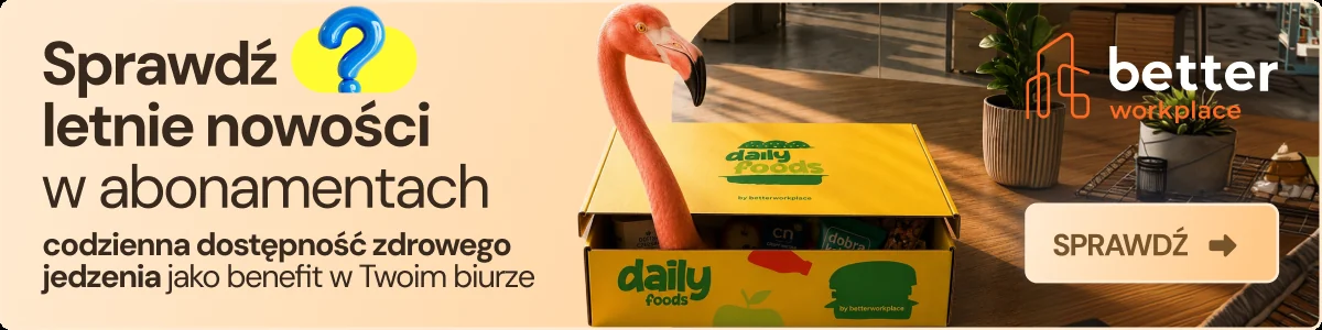
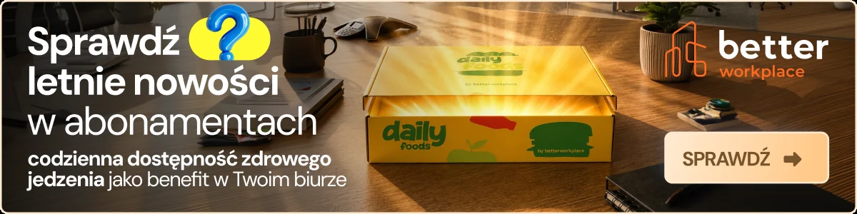
“The body is back at the office. The head is not yet.” A light, holiday register for the hardest weeks after the summer, with a soft landing as the offer.
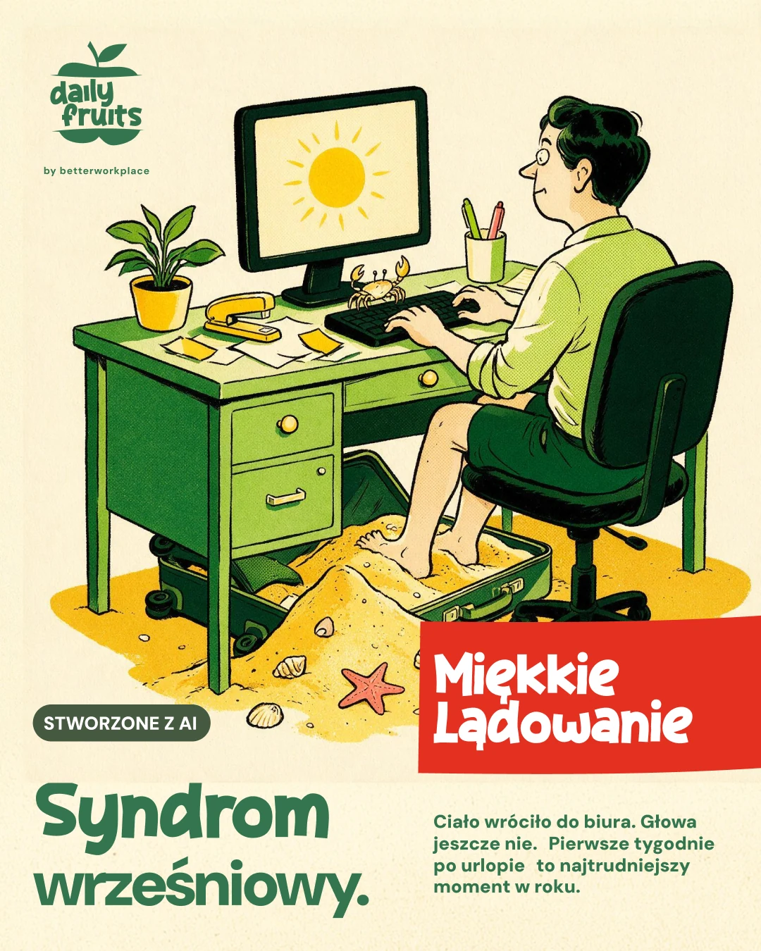
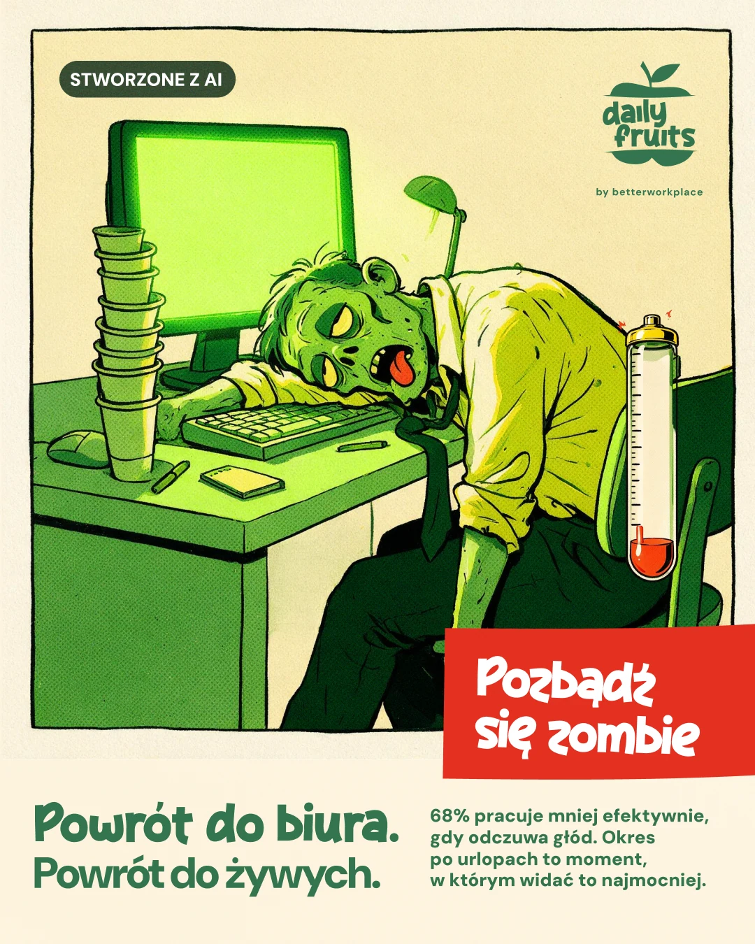
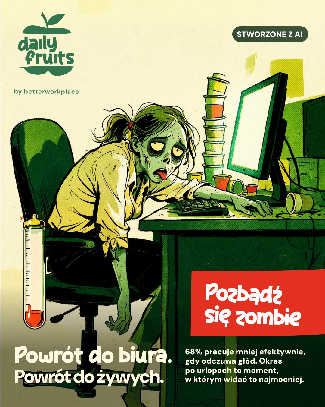
Campaign creatives, in motion and still
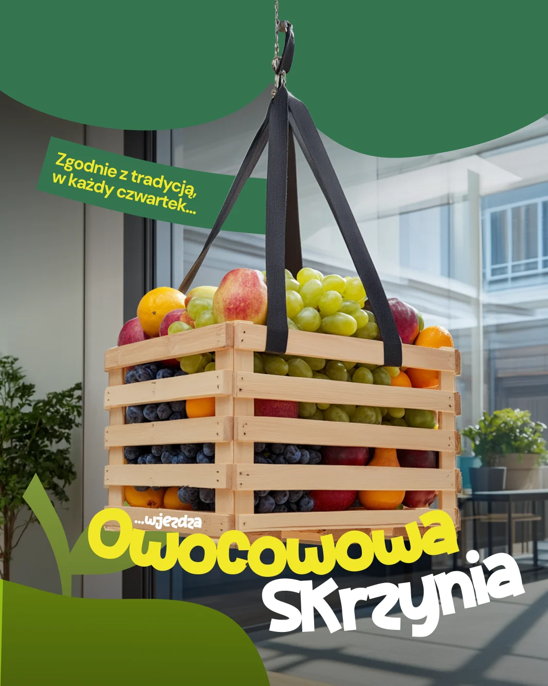
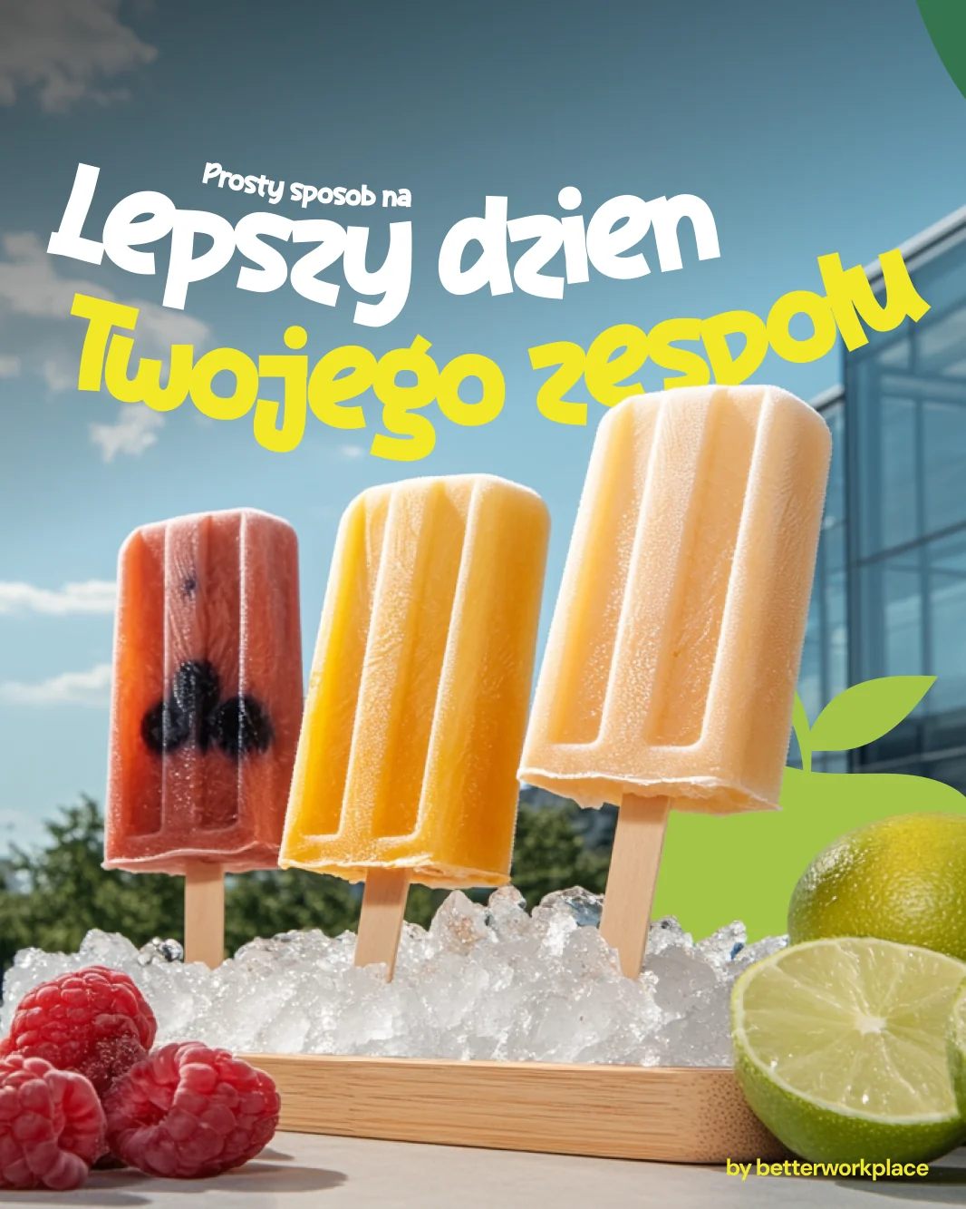
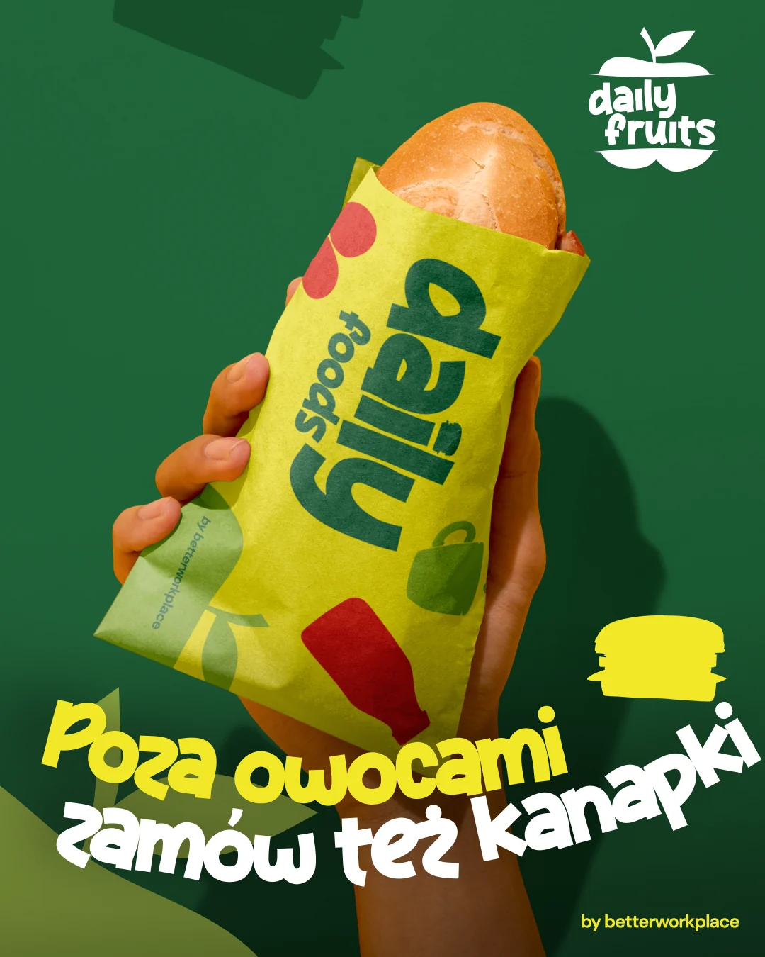
Social, built as a funnel
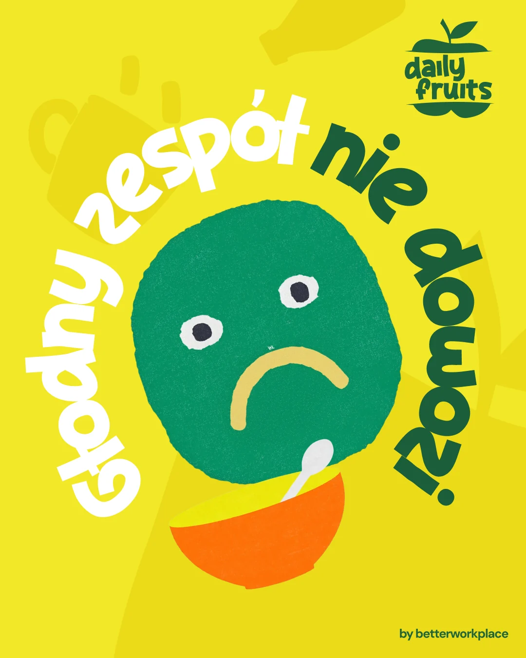
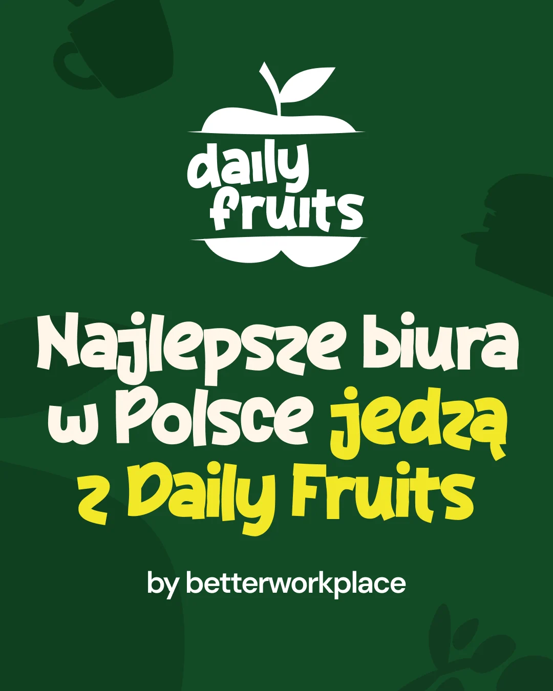
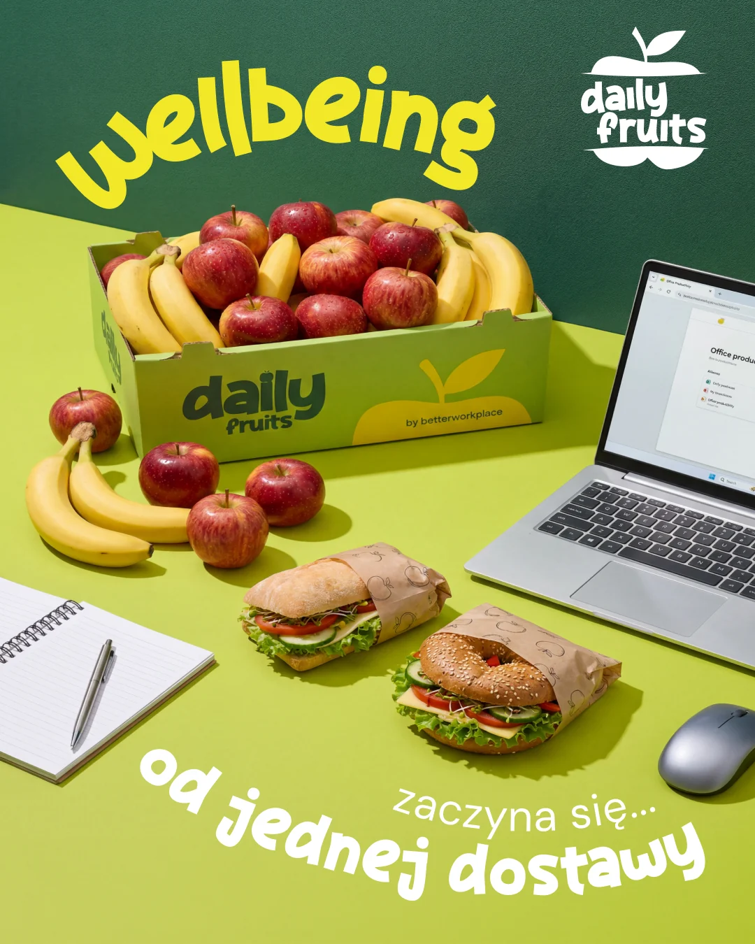
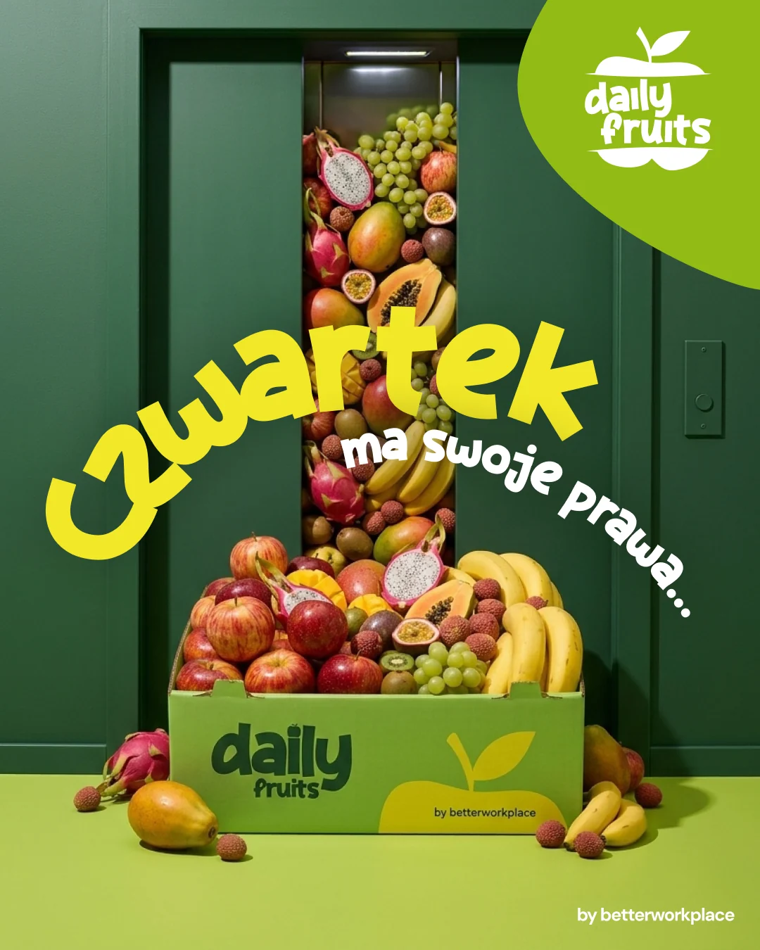
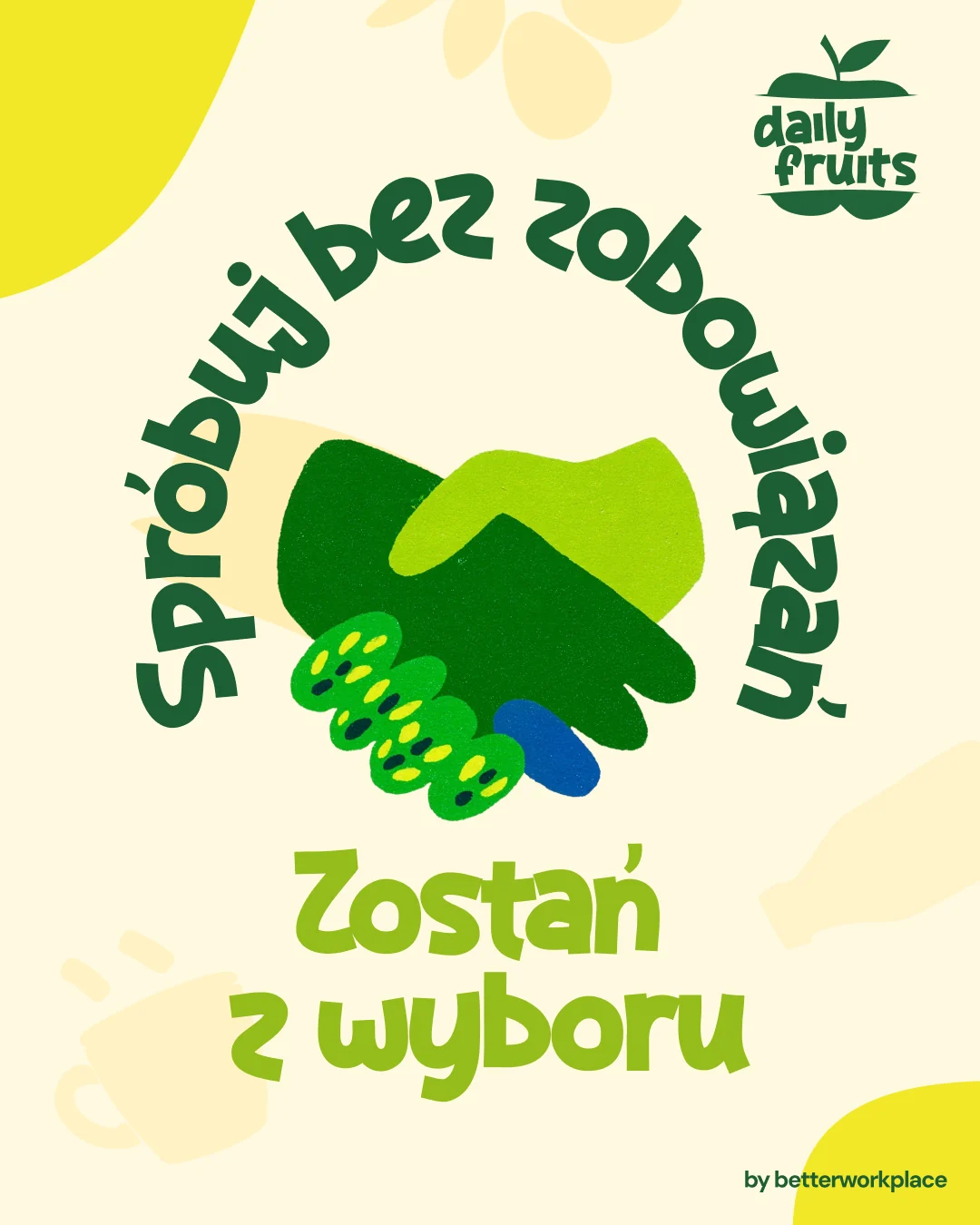
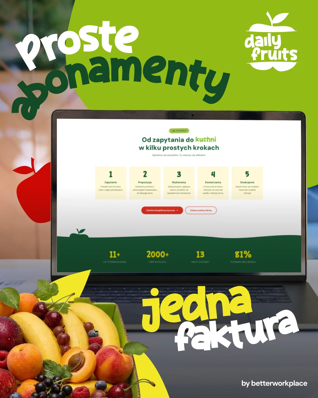
Product and packaging films
One group, five brands
- The group
 The umbrella: what the group sells and how its brands relate.
- Office food
 The largest brand. Rebranded first, with a new site and campaign system.
- Benefit budget
 Personas, funnels, a product story and a film built on the real interface.
- Wellness services
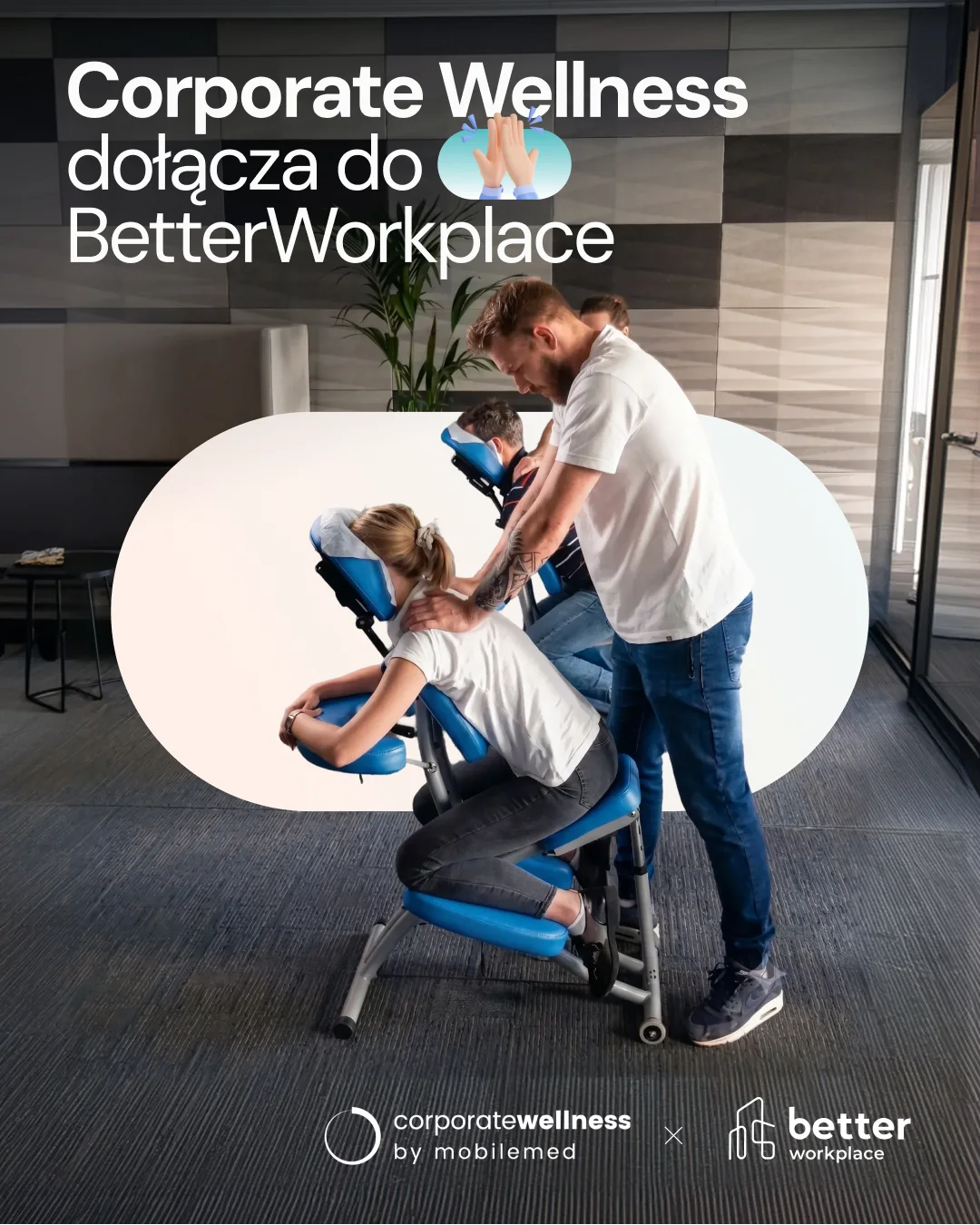
 A brand of the group since mid-2026; first version of the site is up for review.
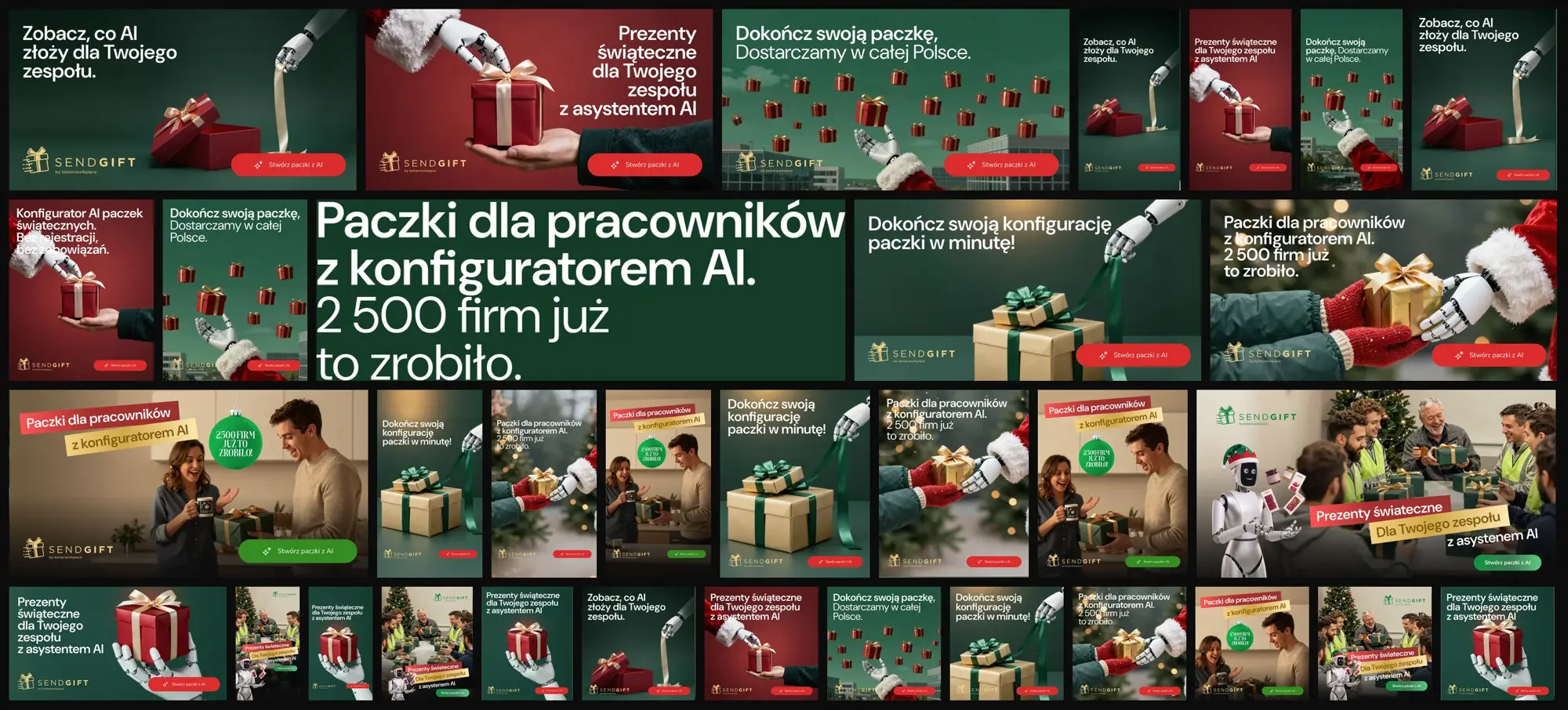
- GiftsSendGiftA Christmas campaign for the AI gift-box configurator.
Brand hub: one address for the whole group
One guide to the group's brand ecosystem: strategy, the deliverables matrix and production files up top, then a shelf per brand with its site, brand guide, catalogue and campaigns.
Performance: two lines, every format
TeamBudget: the product explained in 26 seconds
Corporate Wellness: a new brand gets a site
SendGift: a Christmas campaign for an AI gift configurator




"Until someone decides what is a brand and what is a product line, every redesign repeats the same question in a nicer font.
Outcome
The group has its portfolio described: what each brand sells, which entity is a brand and which is a product line, and a category worth defending, instead of a portfolio that grew by accident. Two architecture models with their costs are on the table and the decision belongs to the owner. DailyFruits runs on the new brand and the new site: the offer is split into category pages, old addresses were carried over without dead links, and content is edited by the client's team. Campaigns run as funnels with their own landings. TeamBudget has a product story and a film built on the real interface. Status: DailyFruits live on the new brand and site since summer 2026; the umbrella architecture handed over with two decision paths; TeamBudget and Corporate Wellness in progress.
Reflection
Multibrand is a decision problem before it is a design problem. The work that moved this account was not a new logo, it was writing down the questions the owner had never been asked out loud and showing what each answer would cost. The rebrand then had something to be consistent with.
